As a general rule, people like the path of least resistance. We prefer to get from point A to point B with ease. This is especially true during a purchase journey, which starts with an experience on a landing page. This path of least resistance mentality should be at the forefront of any landing page design.
Why? Because it increases conversion rates! With fewer distractions on a landing page, we can create a better experience for consumers, and encourage them to do what we want—which is to complete our campaign’s primary KPI.
Oftentimes, we get asked what features and content should exist on a high-converting landing page for a performance campaign. We’ve also found ourselves in situations running a campaign with a landing page that was not set up for success. Aside from a good-looking design and fast page load speed, there are a few things we recommend you consider when building the page—and some things to avoid.
What to include on your landing page
A singular CTA
Having one call-to-action on a landing page is what creates the path of least resistance in the consumer journey.
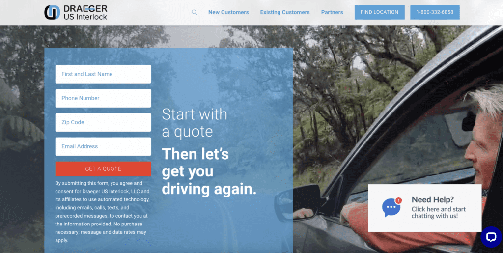
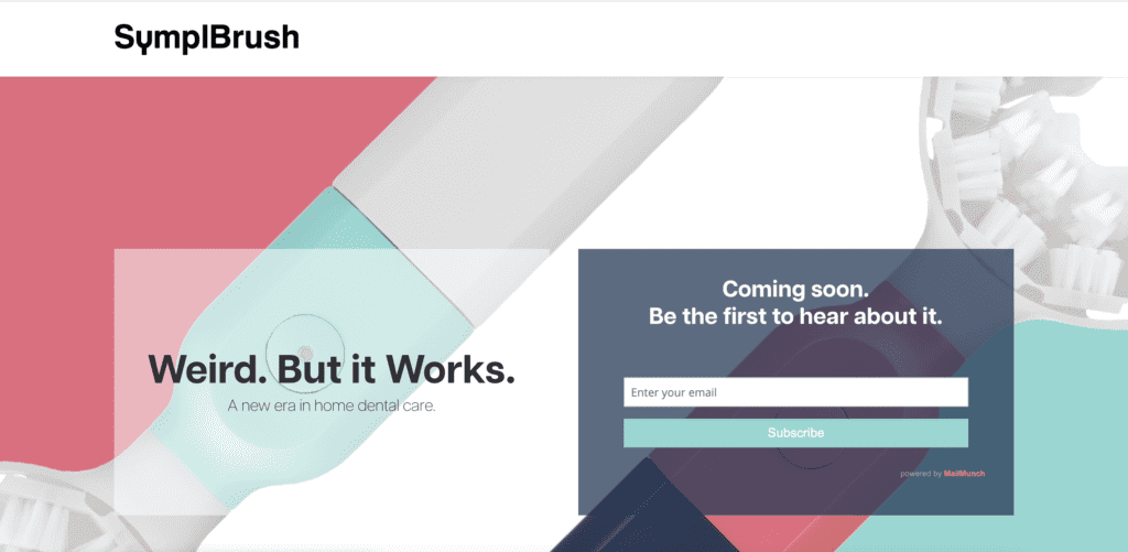
Sometimes, the aesthetic and overall web experience can be over-perfected, and we forget to tell the consumer what we want them to do when they arrive on site. A good campaign landing page should be linear, without too many distractions that a user can find. This is why maintaining a focus on your CTA is important. Whether that is asking your consumer to find a location, enter an email or purchase a product, it tells them exactly what you want them to do without confusion.
CTAs that are easy to see
Arguably as important as a singular CTA is one that is easy to use. Make sure that the action you want your potential custom to take is clear—ideally displayed in the hero of your landing page. Having additional information a consumer might need is great, but having a form at the top makes it easier to push consumers to convert.
Unique Thank You Page URL
Unique URLs are critical for attribution in a performance-based campaign. The best way to confirm that a user took an action, is to track their behavior across the website with distinct URLs. If an email is submitted, but the URL doesn’t change, we would need to rely on button clicks to measure conversions, which is less reliable than measuring how many people reach a unique thank you page.
What to avoid on your landing page
Too Many Steps To Entry
To echo our opening theme, we want little resistance between click and conversion. Try to make sure that there are as few obstacles as possible from getting to the landing page, to submitting an email or making a purchase.
iFrames
iFrames are the bane of a performance campaign’s existence. An iFrame pops up over existing content, with no URL change, and is completely untrackable. Any content or conversions you want to capture should be on the page itself, so that it can be attributed to media, or tracked in site analytics.
Case Studies
Want to see for yourself? Check out the following examples from our very own clients who have seen huge benefits from leveraging these strategies.


Landing page checklist
Below is a checklist you can use to gauge how well your landing page might perform in order to maximize results.
- Singular CTA on page
- CTA is in the hero of the landing page
- Page contains reminders on each page asking the user to take that action throughout content
- Few barriers between click to conversion
- No iFrames being used
- Unique page URLs


